BOCA Restaurant logo
The goal here was to produce a new logo that would transform Boca's brand identity. A bit about the brand:
Boca Restaurant is about passion for the best flavours and cuisine from the French Riviera & Coastal regions of the South of France, Italy and Spain. The exceptional wine list includes over 30 wines offered by the glass or bottle from Italy, France and Spain. Boca truly stands out with its elegant and authentic design from the French and Italian Riviera.
I started this project knowing nothing about these places. I did not even know what a riviera was (turns out it is Italian for "coastline"). So I started my research by travelling to the Italian Riviera on Google Street View to have a look around. These patterned metal fences caught my eye, and thought they would be neat to try and incorporate in my design.
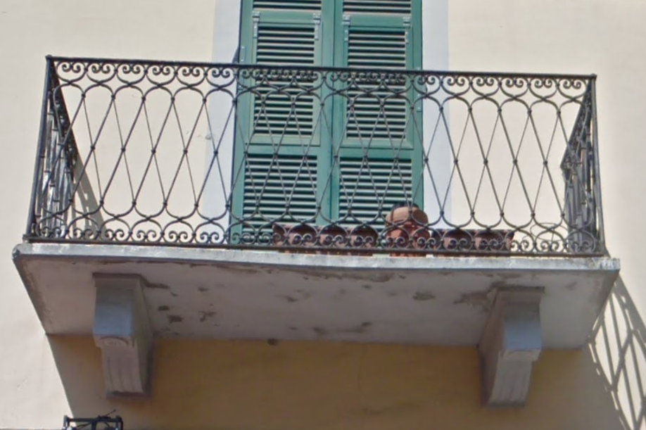
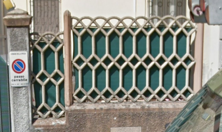
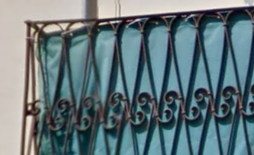
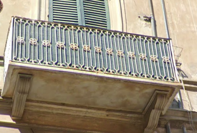
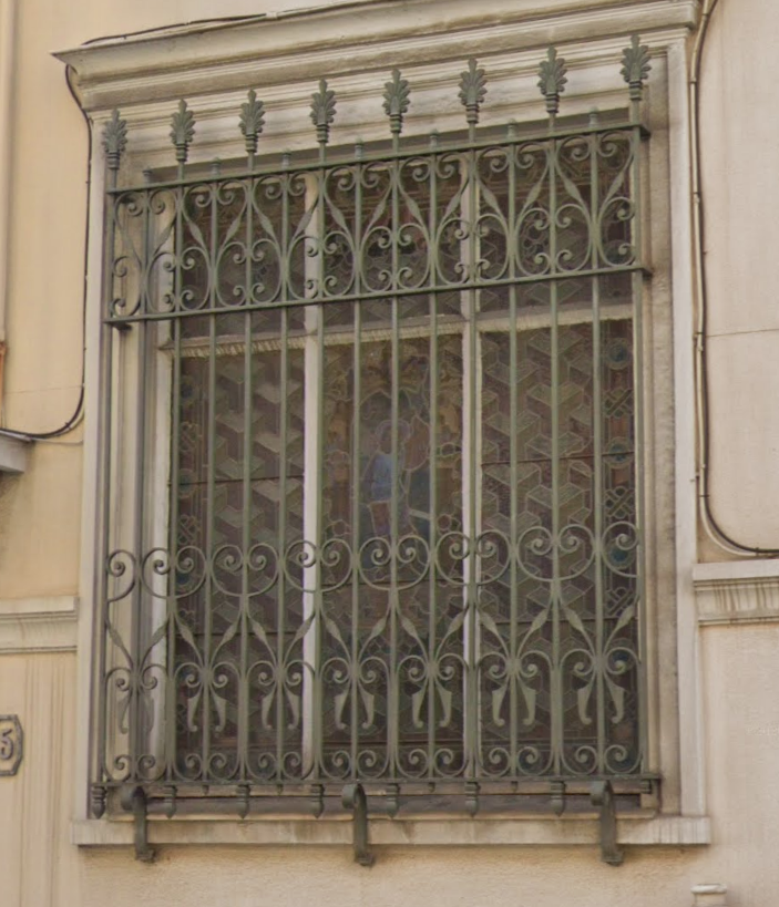
After gaining a rudimentary understanding of how Italians keep themselves falling off balconies, I did some sketching to come up with possible logo shapes. I wanted to include these wrought-iron shapes in the logo as it's clearly popular in the region. They also reminded me of vineyard lattices.

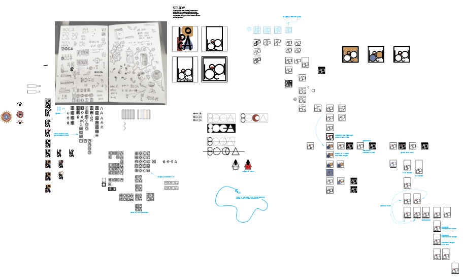
I pulled my sketches into Illustrator and began working out different logo forms. I tried and tweaked a bunch of ideas before deciding on one. I also learned the word manicule.
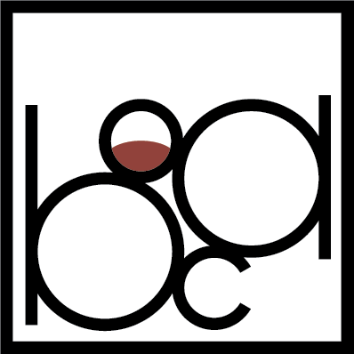
Final Logo
The fences didn't end up making it into the final logo choice.
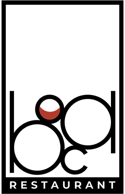
I decided on this logo for the following reasons:
- it includes the restaurant name
- it's shaped like a menu
- the empty space at the top feels airy and comfortable
- it looks like a table setting from above
- it includes a reference to BOCA's large wine selection
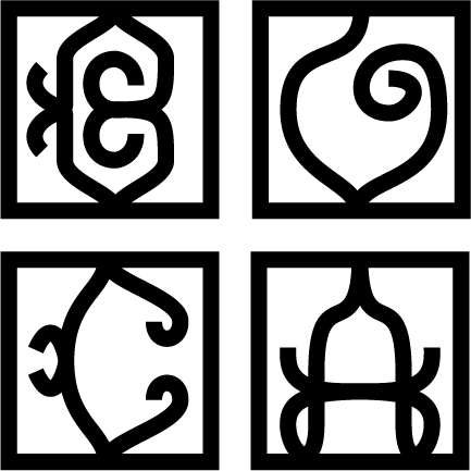
The Best Losers
Here are the logos that didn't quite make the cut.
I like the one on the left but felt that it was too vague to use as the main logo. I did end up using it as a "condensed" alternative on one of the menus.
The one on the right is the result of my fence idea. It took a lot of trial and error to get the shapes to look like fence sections and also be recognizable as letters. Even though it didn't make the cut for a logo, I think the shapes could be used in a different way elsewhere in the restaurant.
This was a challenging project, but it was enjoyable to see the progression of ideas from sketches to the final design.