Canadian Geographic magazine layout
Here is the layout of one section of Canadian Geographic magazine. The document is built on a baseline grid, a 12-column layout, and features consistent details such as image captions and section call-outs. Two font families were used for the entire document.
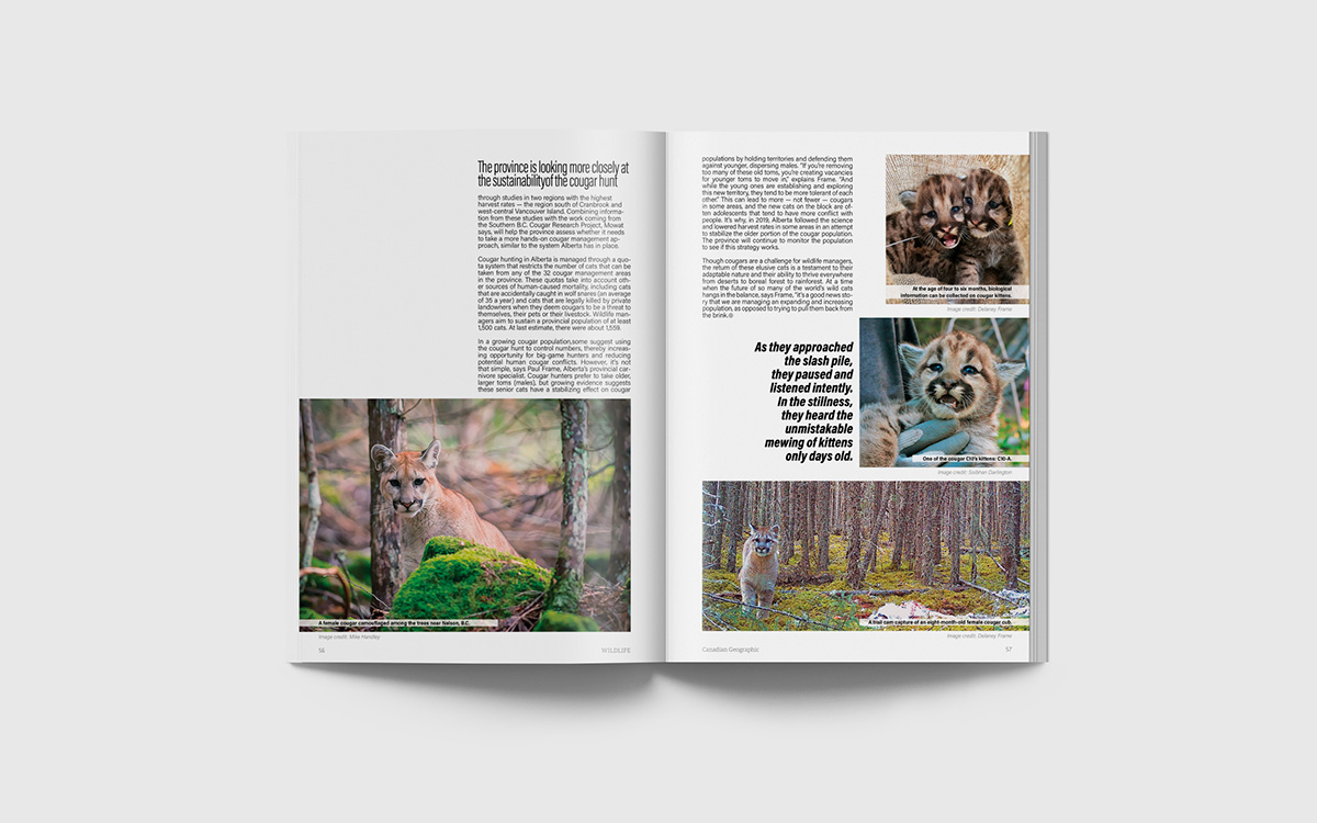
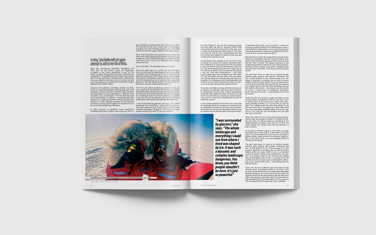
(Images and text were supplied for the assignment.)
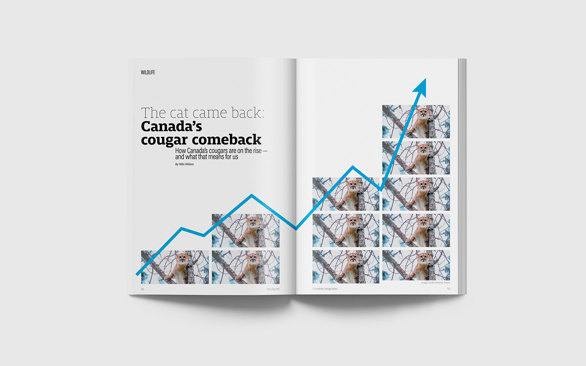
The cover image presented a challenge as it was very low-resolution. I worked around the limitation by repeating the image to visualize the rising cat population.
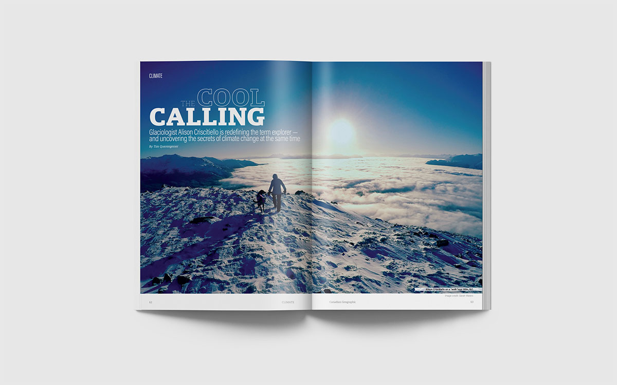
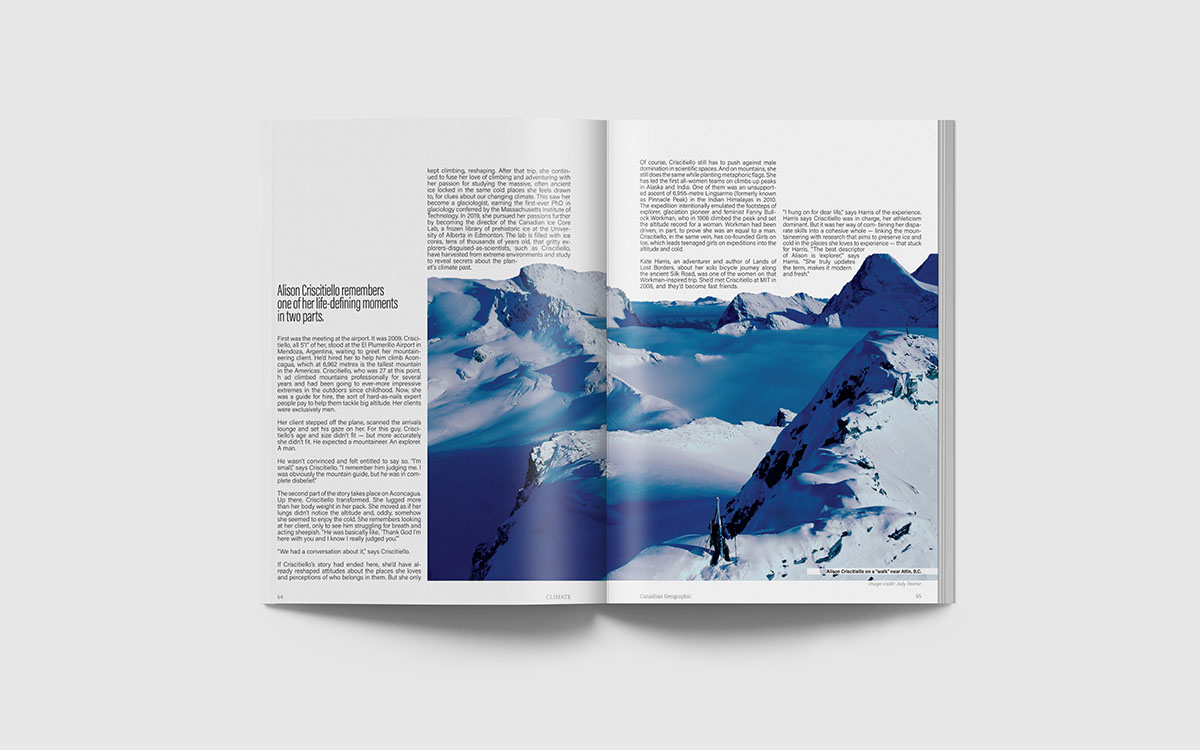
In this last spread, I staggered the columns of text to represent the mountain ranges in the photo. The text is also wrapped around the outline of the mountains.
This project was valuable for me because it emphazised the importance of file organization and the utilization of styles in InDesign. I am very particular about building clean design files, and the time I saved on this project by being strict with style rules was enormous.
