Buffalo Coffee packaging project
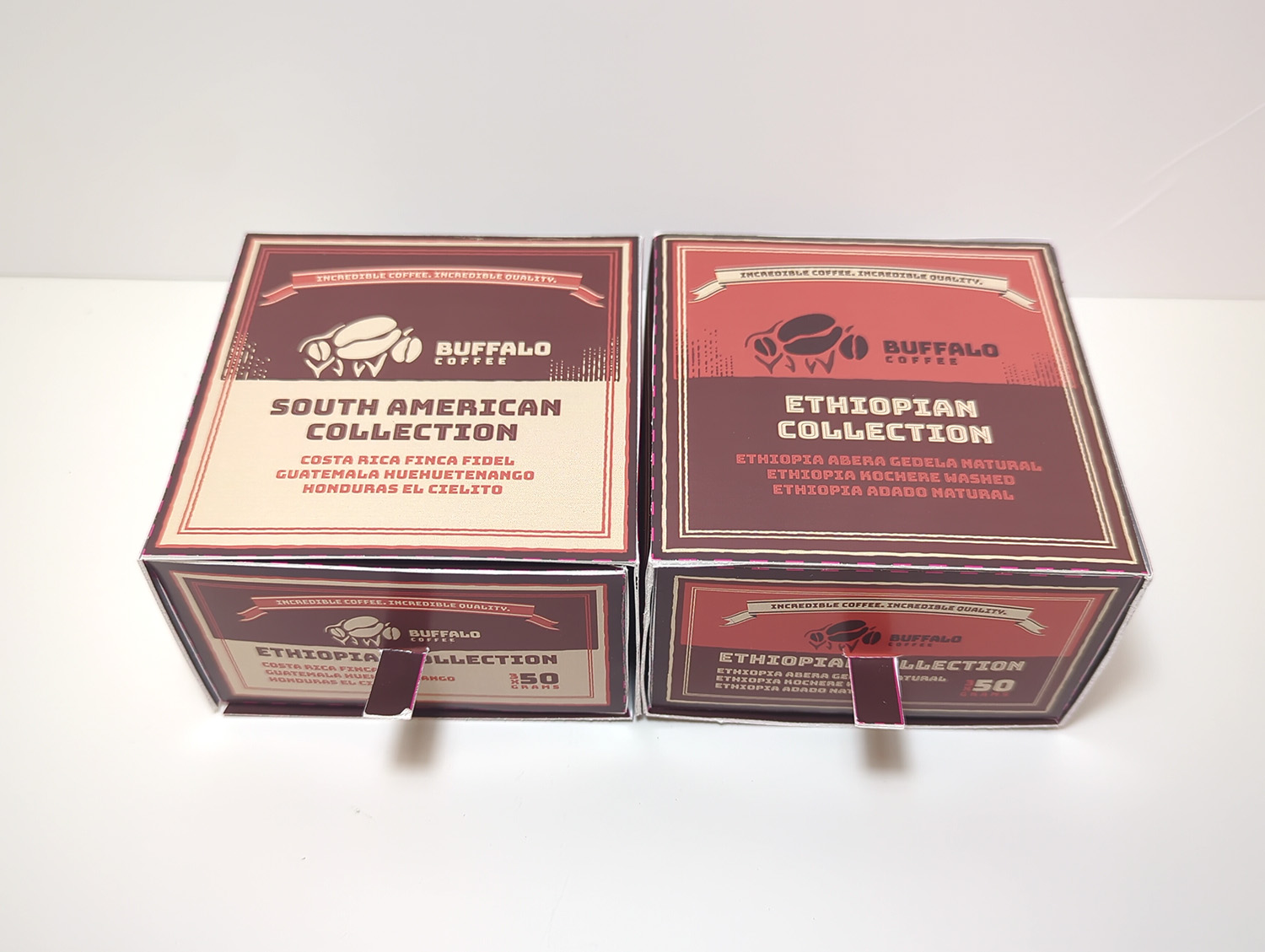
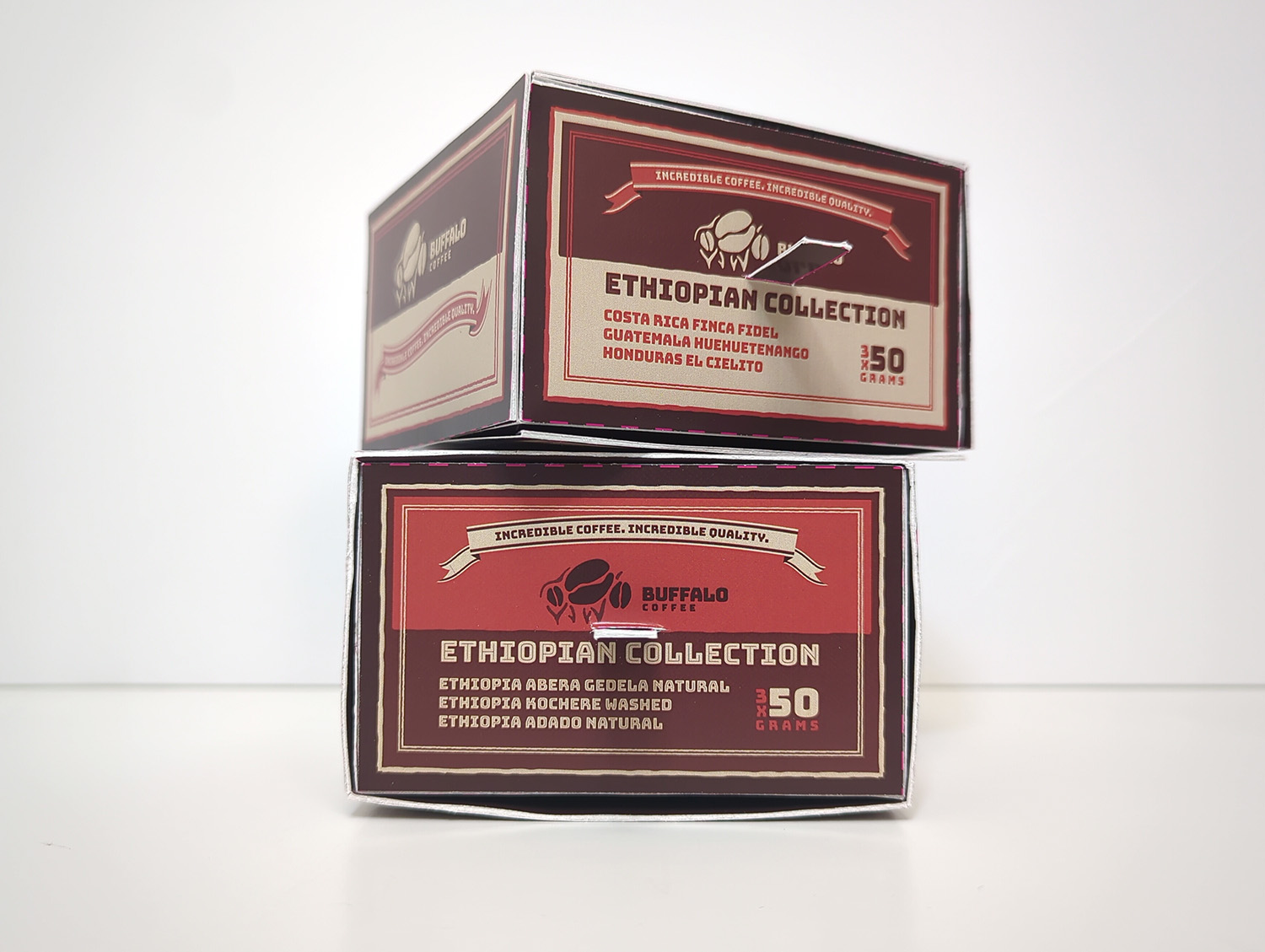
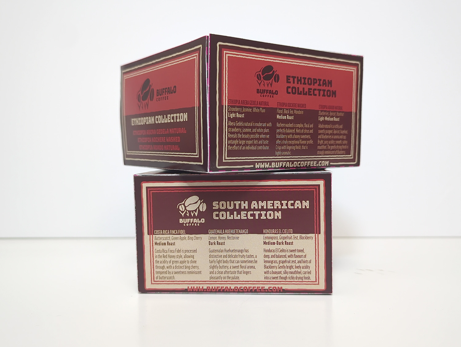
For this project, I was given three small bags of coffee. The challenge was to design two boxes to hold the two different types of coffee beans. The boxes had to compliment one another, and had to include certain branding information like the logo and the copy.
I took inspiration from matchboxes, and tried to use the general shape (an inner box that slides into an outer box), as well as some common design elements such as the banner, the earthtone colours, and the nested strokes.


Click on images to enlarge.
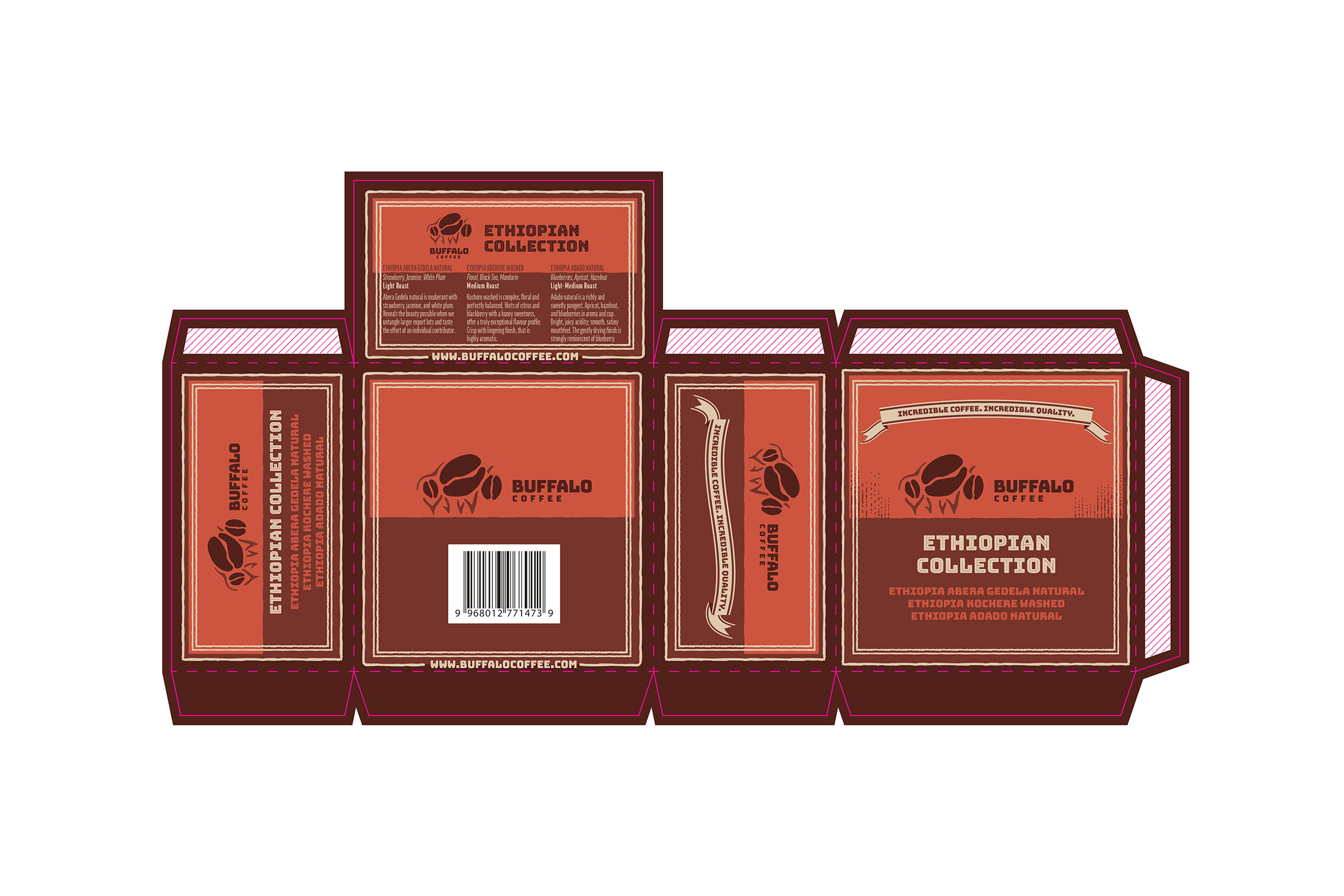
I think I could have gone further with the distressed effects, as seen on the strokes and the line shading on the top of the box. I also should have removed the pink dieline colour from the final print file, as some of the pink is still visible on the boxes.
Here is what the dieline file looks like, for the outer boxes:


Click on images to enlarge.