Leadhead typeface
My goal for this project was to create a headline font for the Regina alternative newspaper The Prairie Dog. The typeface was to be narrow, bold, and different from regular newspaper headline fonts.
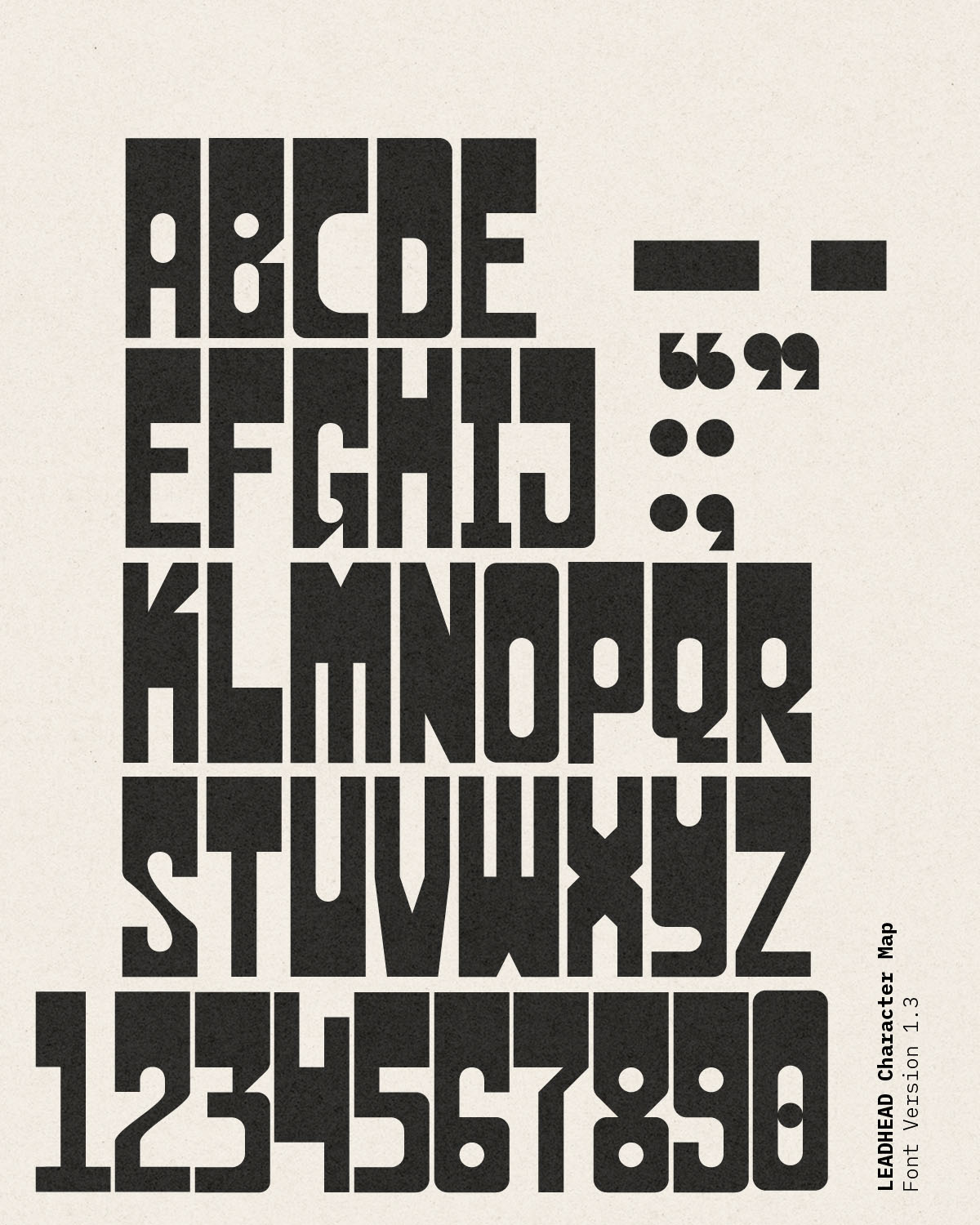
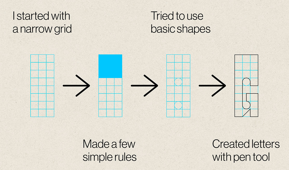
I created 26 uppercase letters, as well as a full set of numbers and a few punctuation marks. Every letter incorporates a large dark section, and was built atop a simple narrow grid.
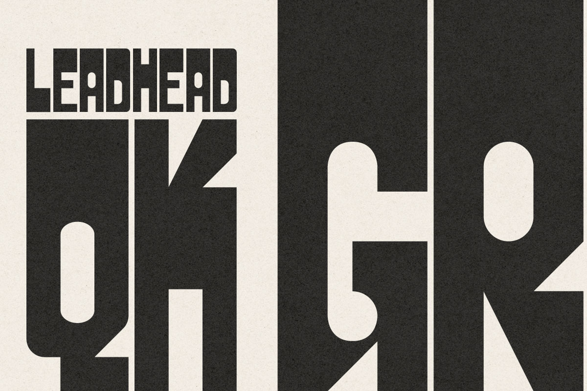
Here are a couple graphics displaying the font in action at several sizes. My favourite aspect of the typeface is the blocky, nearly-monospace shape. It makes the letters easy to kern, as they require nearly zero space between each other.

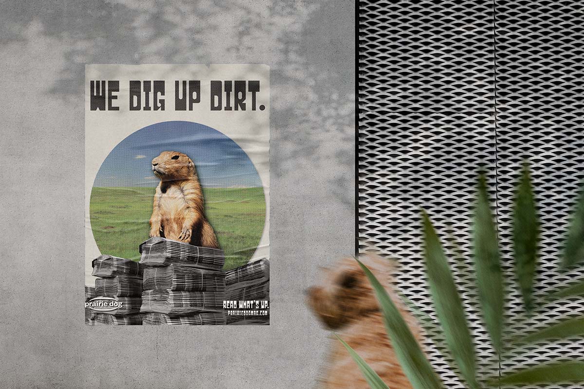
Finally, I created an advertising poster for The Prairie Dog to use to showcase the new font.
I had a TON of fun working on this project! I love typefaces and the process of creating each letterform was extremely satisfying. The most difficult part was figuring out the system of rules that I would follow to ensure the entire font looked uniform.
I used the Fontself plugin for Adobe Illustrator to create the final .otf font file.